
Notice: For best experience, you can duplicate my Deepnote notebook here and run the supporting code yourself.
At Traction Tools we’re highly commmited to make our clients succeed. We run a platform for EOS, which is a system that facilitates entreprenuers to run their business, internal operations, and effective meetings on the cloud.
However, as a SaaS company, it’s very common to deal with issues like churn and customer retention. Here we’re going to discuss how we analyze churn and what are some of the important factors that makes our customer stay or cancel their subscription.
It is very common for companies to try to predict customer churn using the so-called black-box models which are highly complex algorithms that can detect if a client is going to cancel their subscription based on a number of factors.
This is not necessarily bad, but there are better ways to predict tenure and calculate the probabilities of a user churning while using interpretable models which helps us understand what is causing our users to cancel their subscription.
This short article is aimed at data scientist and business analysts that would like to have a better understanding on how to calculate a churn probability for a client, causes, and the overall churn ratio.
Introduction
Because we do software for EOS, and we offer our platform to users that would love to have effective meetings.
Following our business model we have teams which include an n number of users, and an
n number of meetings run every week per team.
This allows us to have a sample dataset that includes:
- Weekly Average Meetings: How many meetings the user runs per week.
- Active User Count: How many users are within a team.
- Has Churned: Marks the observable event of “death” (i.e: cancellation.)
- Cluster Labels: A categorical variable that tell us if the account has high or low activity in the platform.
- Tenure: How many days was the account active in our platform
In this article we will work only with a sample containing synthetic data and limited features to maintain sensitive information private.
Key Objectives
Key objectives from this analysis are:
- Performing a basic and short EDA (Exploratory Data Analysis) to get insights
- Getting the median lifetime of our customers
- Validating if the median lifetime varies per account activity
To run this analysis we’ll use a Python environment with libraries such as Pandas, Matplotlib, and Lifelines. Without further ado, let’s start jumping right into the exploratory data analysis (EDA).
Exploratory Data Analysis
Let’s start by importing some libraries that we’re going to use and also our dataframe to inspect it.
import pandas as pd
import matplotlib.pyplot as plt

# Stablish chart style and figure size
plt.style.use('ggplot')
plt.rcParams['figure.figsize'] = 14, 7

# Load our dataframe and visualize a random sample of the dataframe
accounts = pd.read_csv('clustered_users.csv')
accounts.sample(10)
| weekly_avg_meetings | active_user_count | has_churned | cluster_labels | tenure | |
|---|---|---|---|---|---|
| 424 | 3 | 12 | 1 | low_activity | 798 |
| 691 | 5 | 10 | 0 | low_activity | 800 |
| 2833 | 1 | 5 | 0 | low_activity | 117 |
| 958 | 6 | 70 | 0 | high_activity | 673 |
| 277 | 9 | 63 | 0 | high_activity | 1083 |
| 1035 | 1 | 5 | 1 | low_activity | 365 |
| 399 | 3 | 17 | 0 | low_activity | 992 |
| 3050 | 1 | 4 | 0 | low_activity | 42 |
| 597 | 11 | 44 | 0 | high_activity | 860 |
| 1174 | 4 | 9 | 0 | low_activity | 593 |
The first thing I’m noticing in this sample is that there is a low number of high activity accounts.
Let’s clarify our assumption by running a .value_counts() method on our dataframe.
# Let's pass the normalize argument to give us percentages
accounts.cluster_labels.value_counts(normalize=True)

# Output
low_activity     0.829308
high_activity    0.170692
Name: cluster_labels, dtype: float64
As expected, 83% of our sample is composed by low activity accounts, while 17% of it is taken by high activity accounts.
It would be a good idea to visualize this number in a horizontal bar chart, fortunately this can be easily
done using the pandas method .plot().
accounts.cluster_labels \
    .value_counts(normalize=True) \
    .plot(kind='barh')

# Always label your axes
plt.title('Population Activity Distribution')
plt.ylabel('Cluster Label')
plt.xlabel('Percentage');
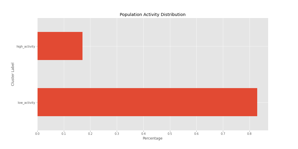
Having a visual representation helps us to identify an issue here, if we run a survival analysis we might have to divide these two groups to better understand their behaviors and lifetime in our platform.
Now let’s consider the tenure column, which is the one that will tell us how much time does a client
stays with us. We can run the .describe() method to get some basic statistics on about this feature.
The first thing I want to do before we run the .describe() method is transforming the column to months
instead of days.
accounts['tenure'] = accounts.tenure / 30.4167
accounts.tenure.describe()

# Output
count    3064.000000
mean       17.252132
std        11.720486
min         0.098630
25%         8.284922
50%        14.564368
75%        23.876686
max        59.342401
Name: tenure, dtype: float64
Now, we have 3,063 observations here, and we can notice that the mean tenure is 17 months, with a
lower bound of 8 months and an upper bound of 23 months.
However, this is not the appropriate way of measuring churn because we cannot say that every client stay with us from 8 to 23 months as not everyone has the same experience, furthermore, we already saw that we have different group of accounts and this information might vary wildly.
Now, let’s compare the behavior of accounts that have cancelled against accounts that are still active in this sample and try to get some insights.
import numpy as np

# group by churn and activity and use
# median and mean aggregations
accounts.drop('tenure', axis=1) \
    .groupby(['has_churned', 'cluster_labels']) \
    .agg([np.mean, np.median])

# Output
                           weekly_avg_meetings        active_user_count
                                          mean median              mean median
has_churned cluster_labels
0           high_activity            10.711111   10.0         39.337374   37.0
            low_activity              2.486349    2.0         11.398427   10.0
1           high_activity            10.285714    7.5         39.642857   37.5
            low_activity              1.900000    1.0          7.957895    7.0
What we have here is a multi-index describing the mean and median values for our features, broken down by account activity for active and cancelled accounts.
Ok, that was a mouthful, but let’s focus on meetings first:
- When it comes to having weekly meetings, active and cancelled accounts with high activity have the same number of meetings on average a week, but a difference of -2.5 when we calculate it using the median.
- For active accounts with low activity, the mean and the median don’t differ wildly. Two meetings a week is reasonable, however, we can notice that for cancelled accounts the number of weekly meetings changes to 1 instead of 2 meetings a week.
Now, what can we conclude about the active user count in each team?
- When it comes to high activity teams the mean and median value for active and cancelled accounts don’t differ much.
- On the other hand, for low_activity accounts that are active we observe that they usually have about 10 users in their team, however, for cancelled accounts we can observe that they usually have 7 users on their subscription, which is a different behavior that requires further analysis.
EDA Key Insights
With this information we can already conclude that keeping our users busy in the platform is paramount to retain them, and because Traction Tools is a collaborative space, having more users in their team increases engagement.
We can already start developing retention strategies to succeed with our customers. Based on this information we can also build machine learning algorithms to detect churn, anomalies, and clients that will provide more value over time.
Let’s go a bit further and try to estimates probabilities around the insights we have discovered.
Using Lifelines for Survival Analysis
There’s a great library out there for properly doing survival analysis created by Cameron Davidson-Pilon called Lifelines.
One of the best libraries for survival analysis that I’ve tried so far. Let’s use this to analyze the chance of survival at any time of our clients subscription.
Global Survivability Rates
We’ll start using the Kaplan-Meier fitter to analyze the the survivability rates for the whole population.
from lifelines import KaplanMeierFitter

# Filter observed events only
churn_filter = (accounts.has_churned == 1)
cancelled_accounts = accounts[churn_filter]

# Feed the model with our dataset for churned accounts
kmf = KaplanMeierFitter()
kmf.fit(cancelled_accounts.tenure, label='Churned Customers')

# Plot the survival chance of our population
fig, ax = plt.subplots()
kmf.plot(ax=ax, at_risk_counts=True)
ax.set_title('Kaplan-Meier Survival Curve — Churned Customers')
ax.set_xlabel('Customer Tenure (in Months)')
ax.set_ylabel('Customer Survival Probability (%)')
plt.show();
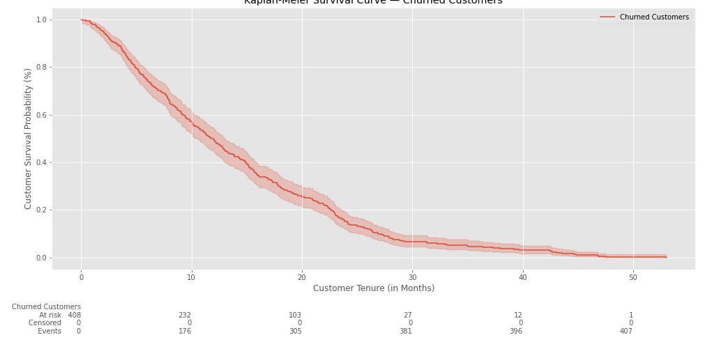
Now we can see the total survival chance of our population at any point in time. In the example above we can observe that there’s initially a 100% chance of survival and it slowly declines as the time goes by.
Of 408 observations, we can see that in the 10th month 232 of them still have an active subscription, but 176 of them have already cancelled.
Now let’s try to get the median survival time and also the survival chance at this point in time.
median_surv_time = kmf.median_survival_time_
surv_chance = kmf.cumulative_density_at_times(median_surv_time).iloc[0]
print(f'The median survival time is: {median_surv_time:0.2f} months')
print(f'With a survivability of: {surv_chance:0.2f}%')

# Output
The median survival time is: 11.74 months
With a survivability of: 0.50%
It seems that after the 11th month our clients have a 50/50 chance of cancelling their subscription. Let’s try now getting a lower bound and upper bound to make sure we have a confidence interval instead of only the median value.
from lifelines.utils import median_survival_times

median_ci = median_survival_times(kmf.confidence_interval_)
lower_bound, upper_bound = median_ci.loc[0.5]
kmf.median_survival_time_

print(f'Survival Lower Bound is: {lower_bound:0.2f} months')
print(f'Survival Upper Bound is: {upper_bound:0.2f} months')

# Output
Survival Lower Bound is: 10.42 months
Survival Upper Bound is: 12.95 months
Now we know that we should take care of accounts that are between 10 to 13 months old. Using this information we can trigger actions to take care of these customers in order to improve their lifespan in the platform.
Segmented Survivability Rates
However, there’s one thing that we have to notice, these are values for the entire population, but we know that we have different types of clients in our sample, and we should separate these two populations and observe their behavior.
To achieve this we’ll separate our populations using the clustered_labels column which separates the
accounts by activity.
from lifelines.plotting import add_at_risk_counts

low_ = (cancelled_accounts.cluster_labels == 'low_activity')
high_ = (cancelled_accounts.cluster_labels == 'high_activity')

fig, ax = plt.subplots()
low_kmf = KaplanMeierFitter()
low_kmf.fit(cancelled_accounts.tenure[low_], cancelled_accounts.has_churned[low_], label='Low Activity Accounts')
low_kmf.plot(ax=ax)

high_kmf = KaplanMeierFitter()
high_kmf.fit(cancelled_accounts.tenure[high_], cancelled_accounts.has_churned[high_], label='High Activity Accounts')
high_kmf.plot(ax=ax)

add_at_risk_counts(low_kmf, high_kmf);
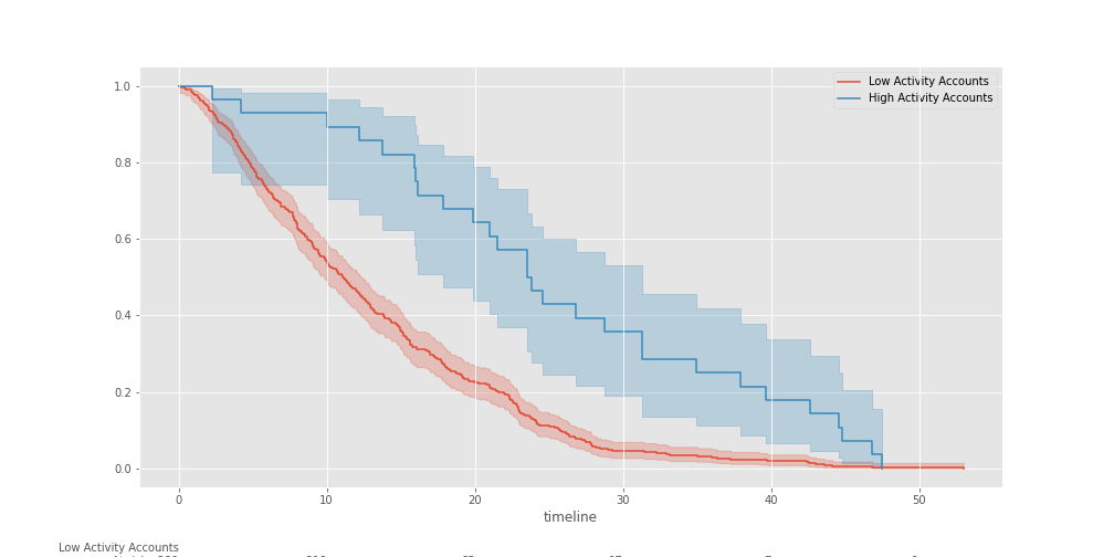
We can already observe that there’s a BIG difference in survivability between accounts with low activity and accounts with high activity. Let’s now get the lower and upper bounds for these types of accounts.
low_median_ci = median_survival_times(low_kmf.confidence_interval_)
lowact_lower_bound, lowact_upper_bound = low_median_ci.loc[0.5]

high_median_ci = median_survival_times(high_kmf.confidence_interval_)
highact_lower_bound, highact_upper_bound = high_median_ci.loc[0.5]

print('Low Activity Accounts:')
print(f'\t- Survival Lower Bound is: {lowact_lower_bound:0.2f} months')
print(f'\t- Survival Upper Bound is: {lowact_upper_bound:0.2f} months')

print('High Activity Accounts:')
print(f'\t- Survival Lower Bound is: {highact_lower_bound:0.2f} months')
print(f'\t- Survival Upper Bound is: {highact_upper_bound:0.2f} months')

# Output
Low Activity Accounts:
    - Survival Lower Bound is: 9.83 months
    - Survival Upper Bound is: 12.26 months
High Activity Accounts:
    - Survival Lower Bound is: 17.88 months
    - Survival Upper Bound is: 31.30 months
This is great! We now know that high activity accounts have more chances of staying with us for a long time than low activity accounts. While low activity accounts can be retained between 9 to 12 months, high activity accounts can stay with us between 17 to 31 months.
From a business development perspective, this is useful information that we can use to help our customers move from a low activity account to a high one to create a more engaging space for them.
Understanding the Impact of Covariates
To finalize this short study, I’d like to understand what would be the impact of our variables like Weekly Average Meetings and Active User Accounts in a team. This will help us to answer questions like:
- Having more users in a team space improves the chances of survival?
- Does having more meetings also affect the chances of survival?
What we’re trying to find out with these questions is if increasing the activity on accounts can change the probability of an account leaving the service early on their subscription.
To begin with we’ll use the Cox Proportional Hazard model to understand how these variables affect the survival chance of a customer. We can directly import the model from Lifelines and then fitting the model with our dataset.
from lifelines import CoxPHFitter
import numpy as np

no_clusters_accounts = accounts.drop(['cluster_labels'], axis=1)

cph = CoxPHFitter()
cph.fit(no_clusters_accounts, duration_col='tenure', event_col='has_churned')

# Output
<lifelines.CoxPHFitter: fitted with 3064 total observations, 2656 right-censored observations>
Once we fitted our model with our dataset we can see how our variables affect the churn probability for different groups. In the example bellow we can see how the survival probability changes for accounts with 5, 15, 25, 35, and 45 users.
cph.plot_partial_effects_on_outcome('active_user_count', np.arange(5, 50, 10), cmap='coolwarm_r');
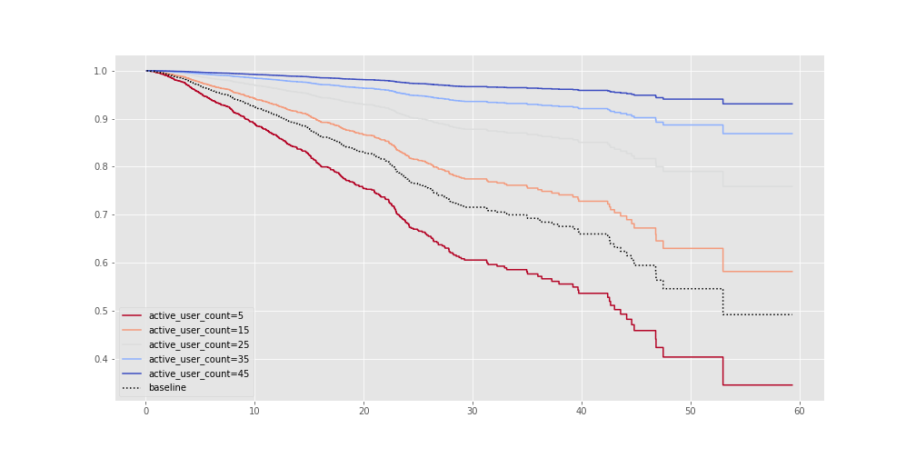
It’s clear that users with sizable teams are more likely to stick around. Because Traction Tools is a collaborative space then it makes sense that having more people in organization accounts improves retention.
Now, I want to see if having a fair amount of meetings within a week improves retention.
cph.plot_partial_effects_on_outcome('weekly_avg_meetings', np.arange(0, 8, 2), cmap='coolwarm_r');
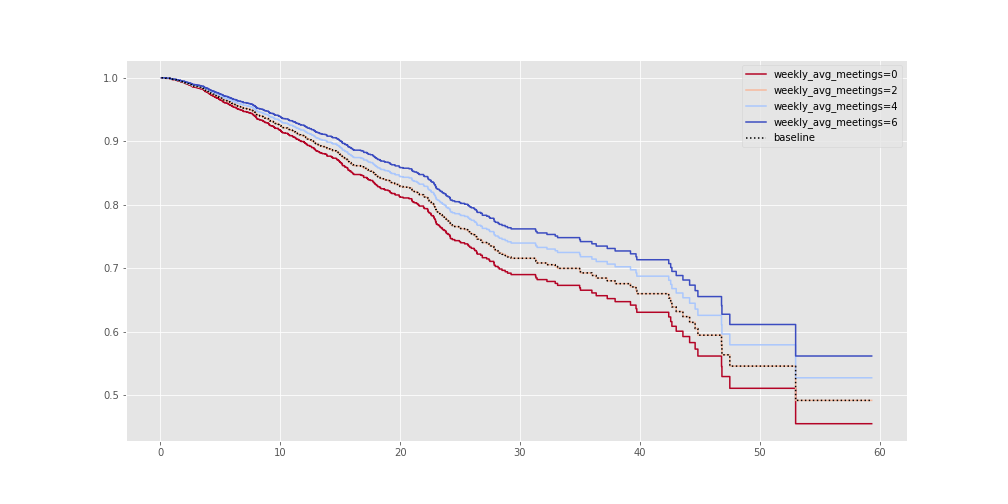
As expected, running a fair amount of meetings improves retention. This is one of the reasons why high activity accounts are more likely to stick around than low activity users.
Conclusion
Trying to manage customer churn is no easy task, however, we were able to uncover a good amount of insights that allow us to drive strategies and make informed decisions based on data. This insights allow us to understand our users when it comes to churning, build alert systems and campaigns based on AI, and provide training to our customers to make collaboration happen.
This is how we use data at Traction Tools to make important decisions, democratize information, and provide value to our customers.
Also, a huge thank you to the team at Deepnote for enabling these tools to help us adopt and scale information as a second language throught our company, can’t thank them enough!